Why Today’s Customers Expect Insurance...
12 Oct 2026

Executives and knowledge workers spend a significant portion of their time in meetings. Many leaders report that meetings consume more than half of their workday, leaving less time for focused execution. A large share of these meetings adds little value, forcing employees to work longer hours to complete important tasks. The real problem is not a lack of effort or collaboration. Instead, teams often lack a single, trusted view of business performance. Without shared visibility, they hold more meetings just to stay aligned.
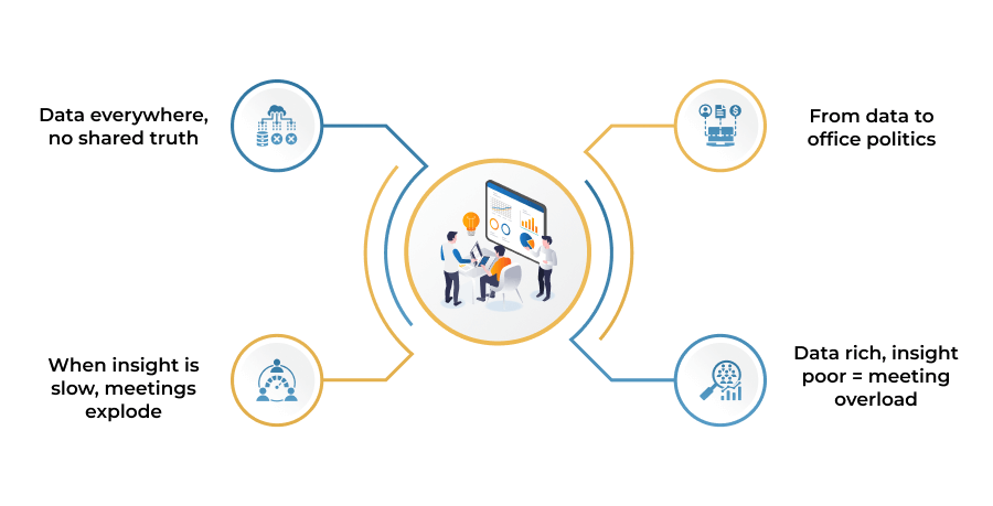
Data Everywhere, No Shared Truth: Modern organizations collect data from CRMs, ERPs, marketing platforms, HR systems, and financial tools. Despite this abundance of data, leaders often lack a single, trusted view of business performance. Information remains scattered across teams and systems. As a result, important decisions often begin with debates about which report or spreadsheet is correct.
When Insight Is Slow, Meetings Explode: Slow and fragmented insights force managers to schedule more review meetings, generate manual reports, and present slide-based updates. For CTOs, PMs, sales leaders, and HR executives, the challenge is not the amount of data. The real issue is accessing the right insights at the right time to make confident decisions.
From Data to Office Politics: When dashboards fail to answer critical business questions, teams rely on opinions, assumptions, and hierarchy instead of facts. Meetings shift from solving problems to debating whose data is correct. As a result, decisions slow down, and calendars quickly fill with unnecessary meetings.
Data-Rich, Insight-Poor Creates Meeting Overload: Many organizations become data-rich but insight-poor. They generate more reports every quarter, but decision-making remains slow. To compensate for the lack of clear insights, teams schedule even more meetings, creating a cycle of meeting overload.
Dashboards That Look Smart but Confuse Everyone
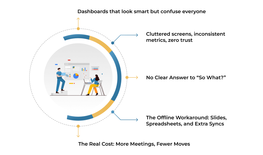
1. Dashboards That Look Smart but Confuse Everyone
Bad dashboards typically are visually appealing and impressive, but if you look deeper they confuse people even more. Instead of providing an easy to follow narrative, they cram users with complicated charts, very small fonts, and an excessive number of colors, thus making stakeholders work hard just to understand what they are seeing. When executives have no clue of what a dashboard is really saying, they stop trusting it and start using follow up conversations to verify basic facts.
2. Cluttered Screens, Inconsistent Metrics, Zero Trust
The sins of bad design that are most common include cluttered layouts, inconsistent metric names, and missing context such as targets, trends or benchmarks are the main reasons why trust quickly fades away. Two departments may be speaking of “conversion rate” while each calculating it in its own way, or getting numbers that don’t correspond to what they have exported themselves. As soon as the data and definitions are suspected to be incorrect, the dashboard ceases to be a source of truth and turns into just another opinion, thus creating the need for even more meetings to decide “whose number is right.”
3. No Clear Answer to “So What?”
The main function of a good dashboard is to quickly provide answers to three questions: What is happening? Is it good or bad? What should we pay attention to next? Bad dashboards stumble on this point. Stakeholders look at charts and still are not able to understand if they are on track, what changed, or which area is most in need of action. When that occurs, the default mode is to set up a review call or to ask someone to “walk us through the data” thus turning something that should be self-serve into an additional scheduled discussion.
4. The Offline Workaround: Slides, Spreadsheets, and Extra Syncs
When the dashboard is not able to provide clear answers, people resort to exporting the data to Excel, creating their own custom pivot tables, and putting together slide decks in order to explain what the dashboard was unable to. Every data export usually starts its own series of reviews: “Can you send your version?”, “Let’s get on the same page before we present it,” “Quick sync?” Thus, in a very short time, the organisation is paying a hidden tax in offline analysis, side conversations, and mini-meetings that only exist because the dashboard did not perform its function.
5. The Real Cost: More Meetings, Fewer Moves
The biggest issue with badly designed dashboards is not only the lack of beauty in them it is operational drag. Any unclear chart or undefined metric introduces friction that later manifests itself in the form of more meetings, slower decisions, and fewer opportunities. Executives spend their valuable time discussing the data instead of doing something based on it. In a rapidly evolving business, that delay is costly, and it is caused not by the shortage of data but by dashboards that were never created with consideration of how actual decision-makers think, scan, and decide.
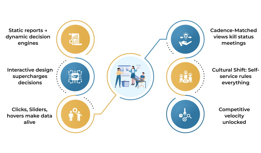
Static Reports → Dynamic Decision Engines
Cadence-Matched Views Kill Status Meetings
Interactive Design Supercharges Decisions
Cultural Shift: Self-Service Rules Everything
Clicks, Sliders, Hovers Make Data Alive
Competitive Velocity Unlocked
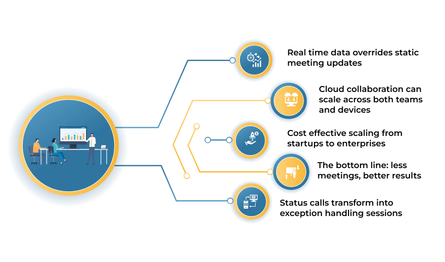
Real-Time Data Replaces Static Meeting Updates
• Real Time Data Overrides Static Meeting Updates: Power BI is the solution for the “yesterday’s news” problem of traditional meetings because it goes beyond live data connections such as Azure, SQL, CRMs, and SaaS apps for automatic, real time dashboard refreshes. The wait for monthly reports is over, sales pipelines, project statuses, and financials update instantly as transactions happen. According to Forrester, companies get a 366% ROI within three years because leaders base their decisions on the current reality, not last week’s summary slides.
• Cloud Collaboration Can Scale Across Both Teams and Devices: Power BI’s Microsoft 365 integration and mobile first design ensure that hybrid teams can view the same live dashboard from laptops, phones, or Teams channels irrespective of their location and time zone. Executives are able to go over QBR metrics while on the move; sales reps can check territory performance before client calls; PMs monitor sprint velocity from home. Automating comments, subscriptions, and alerts ensure that the significant changes are delivered directly to inboxes or Slack, thereby eliminating the need for “status update” syncs.
• Cost Effective Scaling from Startups to Enterprises: With the flexible Pro model ($10/user/month), Premium model ($20/user/month), and a pay as you go capacity licensing, enterprise grade BI becomes affordable without the need for a massive upfront IT infrastructure. SMEs are able to create executive dashboards within a few days; large organizations can use lineage tracking and dataflows to manage thousands of reports. The main difference between Power BI and custom meeting cadences is that the former can grow with the headcount while delivering 3.5x faster ROI through time savings and better decisions.
• The Bottom Line: Less Meetings, Better Results: Power BI not only substitutes meetings, but it also makes them infrequent and shorter by providing instant clarity to the right people at the right time.
• Status calls transform into exception handling sessions: strategy reviews are based on shared facts rather than conflicting prep work. Teams experience a 40–60% recovery of their calendar, which is evidenced by the fact that decisions, which used to take days or weeks, are now made within minutes the ultimate proof that shared, live truth is always superior to scheduled conversation.
Leading organizations now treat dashboards as their primary decision-making hub, not just reporting tools. Instead of displaying static reports, modern dashboards answer critical business questions such as “Are we on track for quarterly revenue?” or “Which projects are at risk?” They organize insights around daily operations, weekly performance, and monthly strategy. As a result, teams replace many status meetings with quick, data-driven reviews.
Research shows that interactive dashboards improve both operational and strategic decision-making. Executives gain faster access to reliable metrics, evaluate different scenarios, and measure the impact of previous decisions. This reduces the need for frequent review meetings and encourages a “Check the dashboard” culture instead of “Call a meeting.”
A decision hub that is truly effective has several features that differentiate it from a pretty but non functional chart wall. It concentrates on a few leading and lagging indicators only, connects them to clear business objectives, and visually indicates like thresholds and alerts to attract attention to the places where it is needed most. Drill‑downs enable executives and managers to go from overview to cause of the problem without requesting a separate analysis.
Most importantly, ownership is clear; someone is responsible for metric definitions and data quality, so every stakeholder knows they are looking at a shared source of truth. By linking the dashboard to decision workflows such as forecast changes, resource allocation, or project prioritization companies make sure that discussions are initiated with facts, not by looking for files. Hence, meeting time is shortened very much and the need for recurring updates is often removed completely.
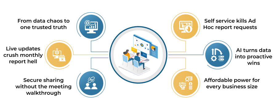
Traditional dashboards explain what happened. Modern analytics platforms such as Power BI go further by using embedded AI to explain why it happened and predict what may happen next. Features such as anomaly detection, automated insights, decomposition trees, and forecasting help users identify trends without requiring data science expertise. As a result, teams spend less time discussing assumptions and more time making informed decisions.
AI-powered dashboards also encourage proactive decision-making. Instead of reacting after KPIs decline, leaders can identify risks early, adjust plans, and allocate resources more effectively. This reduces the need for lengthy investigative meetings and helps organizations make faster, data-driven decisions
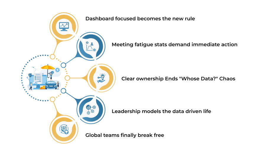
Leading organizations follow a “dashboard-first” approach. Key metrics remain available 24/7 through reliable dashboards, allowing employees to review performance before meetings. Managers spend less time sharing status updates and more time making strategic decisions. As a result, routine meetings decrease, and teams resolve many issues independently. Organizations that embrace this approach improve employee autonomy, reduce meeting fatigue, and enable global teams to collaborate effectively across time zones.
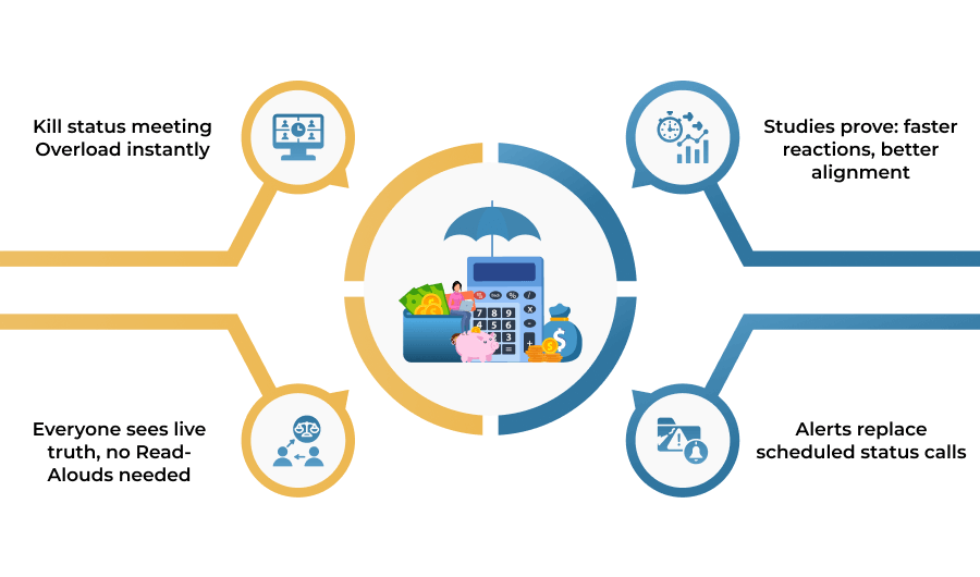
Meeting fatigue has become a major productivity challenge. Around 71% of employees feel overwhelmed by the number of meetings, while 55% describe most meetings as unnecessary and time-consuming. In the US alone, organizations lose an estimated $37 billion in productivity each year. Leaders can reverse this trend by replacing unnecessary meetings with real-time dashboards and focused decision-making. Power BI workspaces and Microsoft Teams integration provide up-to-date insights, improve collaboration, and help teams spend more time executing instead of coordinating.
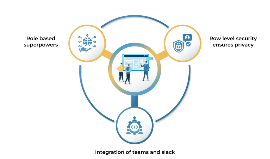
Clear ownership starts with assigning dedicated metric stewards. They ensure data accuracy, maintain updates, and define business metrics consistently. As a result, teams spend less time debating conflicting spreadsheet data and more time making informed decisions. Cross-team workspaces with role-based access control (Admin, Contributor, Viewer) provide secure access while protecting sensitive information. For example, Finance can own revenue KPIs, while Sales manages pipeline health. This clear ownership improves collaboration, builds trust in data, and accelerates decision-making across the organization.
Leadership transformation begins at the top. Modern executives rely on Power BI dashboards and real-time metrics instead of lengthy status meetings. Weekly data spotlights help leaders share cross-functional wins and make faster, data-driven decisions. Messages like “Dashboard green, meeting canceled” reflect the growing shift toward an asynchronous, insight-driven culture. As more organizations adopt this approach, leaders spend less time in meetings and more time driving business outcomes.
An async-first approach allows global teams to work efficiently across time zones. For example, Berlin can manage EMEA sales while Tokyo handles APAC operations without early-morning or late-night sync meetings. Power BI mobile apps and collaborative comments on live reports give everyone from frontline employees to executives access to real-time insights. This replaces long email chains and supports a more flexible way of working. As a result, organizations can improve employee retention by 25%, increase productivity by 34%, and keep global teams aligned with a single source of truth.
Modern teams do not need more hours on Zoom or in boardrooms. They need faster access to accurate, shared information that supports confident decision-making. Well-designed Power BI dashboards unify fragmented data into a single, reliable source of truth. This reduces the need for routine status updates and reporting meetings.
Real-time dashboards and AI-driven insights create a data-first culture. Organizations can reduce unnecessary meetings, improve decision quality, and help employees focus on execution instead of constant coordination.
12 Oct 2026

08 Oct 2026
05 Oct 2026